
Looking your best at a Family Photo Session
Your Guide for What to Wear
What to Wear
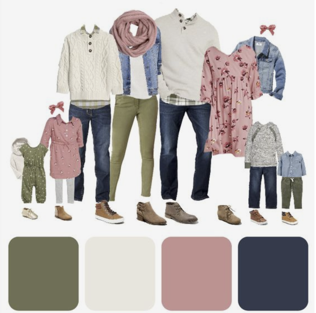
Coordinate colors. I suggest picking a color palette of 3-4 colors that share tones. Such as autumn tones, earth tones, gem, pastel, neutral, etc. This allows everyone in the family to express their own sense of style within the palette, but also coordinate you all beautifully.
When picking a color, such as blue, all of the blues don't have to match. They can be all different shades and different textures and will actually look more natural if they are slightly different. Avoid all black or all white clothing. Avoid neon colors, as they can reflect on your skin, making your skin an odd hue.
For my editing style, creams, pastels, earth tones, and jewel tones work really well.Accessories can be fun. Necklaces, scarves, and hats can be fun pops of color and fun to play with in photos. The accessories you pick can help pull your color scheme together. You can also bring a blanket if you would like. Limit patterns and think about how the blanket matches what you're wearing.
A mix of patterns & solids. A mix of patterns, solids, layers, & textures gives visual interest to photos. Just make sure your clothes don't take over the image. We want your family to be the star!
You can definitely have a pattern or two in the mix that incorporates the colors you've picked, however it will be distracting if everyone is wearing patterns. If you have a patterned piece of clothing that you really love, you could build your color palette from that piece and it will fit nicely in the mix.You want you and your family to look like you. Don't pick clothing you would never normally wear. Be who you truly are!
And finally... start with Mom's outfit! If Mom feels great in what she's wearing, the rest is cake.
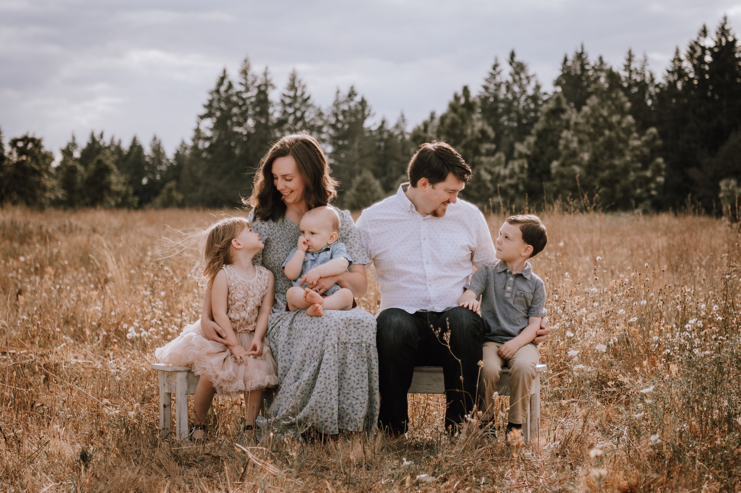
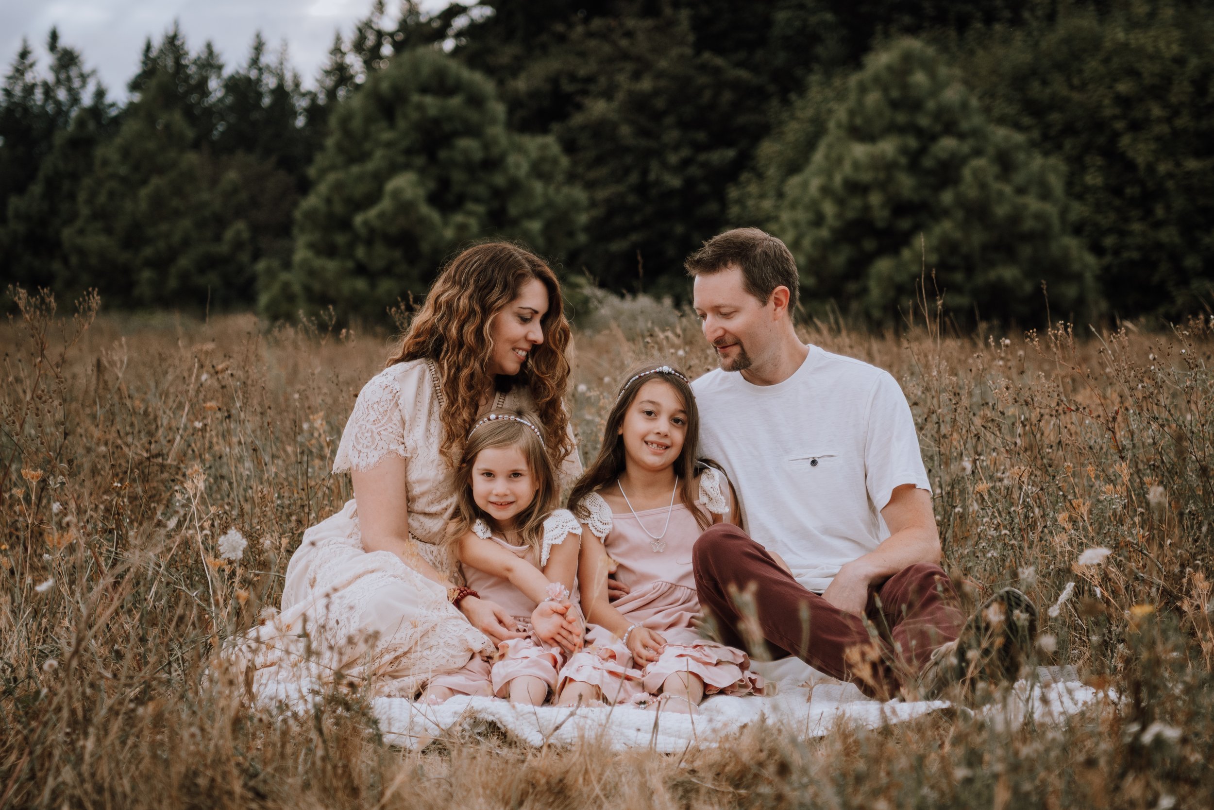
Need some inspiration?
Take a look at these examples!


Feel free to send me a photo of clothing choices and I can help you refine.
Email lianarobinphotography@gmail.com